

Why Colour Analysis Works - and What It Can't Tell You
Colour analysis is built on the observation that certain colour temperatures and saturation levels interact with skin undertones, hair, and eye pigmentation in ways that are either harmonising or competing. When a colour harmonises with your natural colouring, it tends to reduce the appearance of shadows, redness, and unevenness - making your face look clearer and more defined. When a colour competes, it can do the opposite.
This is the practical core of any professional analysis, and it's entirely observable at home with the right setup. What a professional consultation adds is trained pattern recognition and a wider range of swatches - useful, but not essential for a personal starting point.
It's worth noting that colour analysis tells you which colours tend to be optically harmonious with your features - it says nothing about which colours are appropriate, desirable, or expressive for you personally. As we explore in what personal style actually means, dressing well is ultimately about self-expression, and that goes beyond what's technically flattering.
Lighting Changes Everything
Always assess colour swatches and your complexion in natural daylight - preferably near a window but out of direct sun. Artificial lighting (especially warm incandescent or cool fluorescent) distorts both fabric colour and skin tone, making warm undertones look cooler and vice versa. Decisions made under artificial light are frequently misleading.
Use the results of colour analysis as one input into how you dress - not a definitive verdict on what you're allowed to wear.
How to Run Your Own Colour Analysis
The process below works best when you approach it methodically and with patience. Give yourself 20-45 minutes in a well-lit space, and treat the results as a working hypothesis rather than a fixed conclusion. Over time, repeated observation will sharpen your accuracy.
What you will need
Fabric swatches (warm and cool tones)
Held near your face to reveal how different colour temperatures interact with your undertone.
Plain white paper or white fabric
Used as a neutral reference to identify whether your skin reads warm, cool, or neutral against pure white.
Natural-light mirror setup
Ensures accurate colour assessment without the distortion of artificial lighting.
Notebook or notes app
Record which colours produced the most flattering or unflattering results during testing.
Find your skin undertone using the white paper test
Hold a plain white sheet of paper or white fabric directly next to your bare inner forearm in natural daylight. Observe the colour cast your skin takes on against the neutral white. If your skin appears yellowish, peachy, or golden, your undertone is likely warm. If it reads pinkish, bluish, or cool-rosy, your undertone is likely cool. If you struggle to read a clear cast either way, you may be neutral - which means you can wear colours from both warm and cool families successfully.
Assess your natural contrast level
Stand in front of a mirror and consider the visual difference between your hair colour, eye colour, and skin tone. If these three elements are dramatically different from one another - very dark hair against very light skin, for example - you have high contrast colouring. If your features sit close together in value (medium hair, medium skin, medium eyes), you have low to medium contrast colouring. This matters because high-contrast individuals often carry bold, saturated colours well, while low-contrast individuals tend to look most harmonious in softer, more tonal combinations.
Test warm versus cool fabric swatches near your face
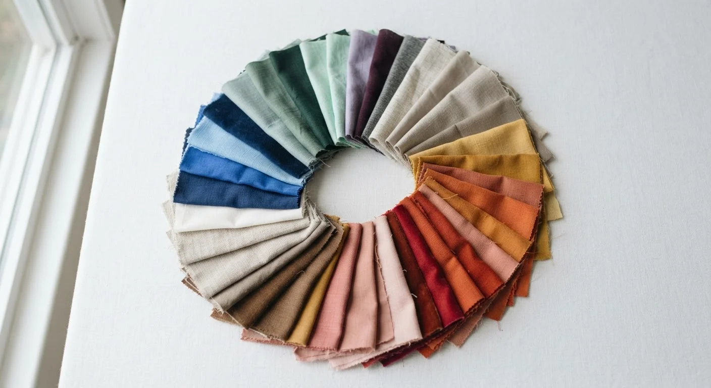
Gather swatches in clearly warm tones (terracotta, mustard, olive, warm coral) and clearly cool tones (lavender, icy pink, cobalt, cool teal). One at a time, hold each swatch under your chin and observe your face - not the swatch. Look for whether any shadow or dullness appears under your eyes, whether redness increases, or whether your skin looks smoother and more even. Colours that minimise shadows and create an even, lively appearance are likely in your palette. Those that cast a greyish shadow or exaggerate redness are generally working against your undertone.
Map your results to a seasonal palette as a reference point
The four-season framework - Spring, Summer, Autumn, Winter - groups undertone and contrast together into broad palettes. Spring typically suits warm undertones with low-to-medium contrast (clear, delicate, peachy tones). Autumn suits warm undertones with medium-to-high contrast (rich, earthy, muted tones). Summer suits cool undertones with lower contrast (soft, dusty, muted tones). Winter suits cool undertones with high contrast (bold, saturated, or icy clear tones). Use whichever season aligns with your undertone and contrast assessment as a starting collection of colours to experiment with - not as a rigid boundary.
Test your provisional palette in your existing wardrobe
Rather than shopping immediately, pull out clothing items in the colours your tests flagged as flattering and wear them over the next few weeks. Notice how you feel in them, how often others respond positively, and whether they pair easily with other pieces you own. This real-world feedback is the most reliable final confirmation. If certain colours consistently make you feel energised and receive positive comments, they belong in your palette. Items that rarely get worn despite being technically flattering may be signalling a mismatch with your personal aesthetic beyond colour - and that's worth noting too.
Trust Your Gut Reaction First
Before analysing anything logically, note your immediate emotional response when you hold a colour near your face. If you instinctively want to look away or feel the colour is competing with you, that's useful information. Colour analysis works best when observation and instinct are used together.
Once you have a clearer sense of which colours work with your natural colouring, the next step is integrating that knowledge into how you build and shop your wardrobe. Our wardrobe-building framework and guide to dressing with intention are natural next steps for putting these insights into practice.
Avoid Basing Decisions on Tan or Makeup
Conduct your undertone test with a bare, freshly cleansed face and in your natural skin state - not post-sun exposure or tanning, which temporarily shifts surface tone. Similarly, remove makeup before testing, since foundation and blush alter the undertone signals you're trying to read.